
Sanjiu
Mini App
@ Capgemini
Overview

A redesign of the original WeChat mini-app for Huarun Sanjiu RXSDP's Chinese medical professionals and representatives to improve usability, efficiency, and functionality. The app consists of two modules:
Doctor’s App: Enhances engagement through an improved points system, video learning, and academic event participation.
Representative’s App: Streamlines doctor and hospital management, training, and performance tracking.
Role: UI Designer
Tools Used: Figma, Sketch, Adobe XD
Project Timeline: June 2024 – July 2024
Problem Statement
The original WeChat mini-app had usability challenges, including:
Limited engagement due to unclear UI and navigation.
Inefficient integration with third-party services.
Poor visibility into training, questionnaires, and academic event participation.
The redesign aims to enhance usability, engagement, and system efficiency for both doctors and representatives.
yinuoxiang@gmail.com

Research & Discovery
User Research & Key Insights
Conducted interviews with doctors and representatives to understand their pain points.
Analyzed current usage data to identify drop-off points and inefficiencies.
Competitive analysis of similar medical apps for feature benchmarking.
Findings
Doctors wanted better access to academic resources and a clearer points tracking system.
Representatives needed easier hospital and doctor management tools.
Navigation and UI needed simplification.
Example of Persona
Design Process


Points Mall
Redeem rewards and track points history
Video Section
Learn and watch, and earn points
My Sharing
Share academic content and earn points
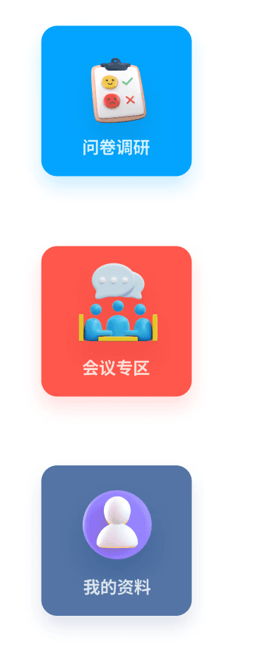
Questionnaire Research
Participate in surveys, view history, and earn points
Conference Section
Join meetings, and track attendance for points
My Profile
Update personal information and receive points
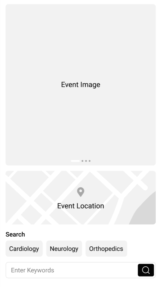
Wireframes & User Flow
Created low-fidelity wireframes to map out user journeys for both roles.
Iterated based on feedback before developing high-fidelity designs.
Example of Initial UI Design
After presenting the initial UI wireframe to Huarun Sanjiu, they requested a more visually prominent design instead of clustering all functions on the homepage.
In response, I integrated the six features into a single page with clickable icons while maintaining a consistent UI across all sections.
Important Features


Reward System & Points Tracking (Core Feature)
The app's key feature is a reward system that tracks doctors' earned points, motivating them to learn and collaborate actively.
Points can be redeemed in the Points Mall for various rewards.
The system encourages continuous learning and professional engagement.
Example of Earning Points
Based on point statistics, the representative's interface displays the doctor's level, allowing representatives to edit their titles/tags, enabling the system to better allocate relevant academic resources.
Final UI Design
Doctor’s App
✅ Improved Points System — Tracks questionnaire, video, and event participation rewards.
✅ Enhanced Video & Meeting Modules — Displays progress, deadlines, and participation benefits.
✅ Streamlined Profile & Sharing — Allows easy content sharing and profile completion for incentives.
Representative’s App
✅ Optimized Doctor & Hospital Management — Intuitive tools for adding, editing, and tracking.
✅ Integrated Training & Performance Tracking — Simplifies monitoring and reporting.
✅ Automated Tagging System — Enhances segmentation with behavior-based categorization.
Reflection
Challenges
Integrating a complex points system while keeping UI simple.
Lessons Learned
Prioritizing user research helped identify the most critical improvements.
Future Improvements
Further automation in tag management and AI-powered recommendations.
